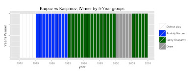
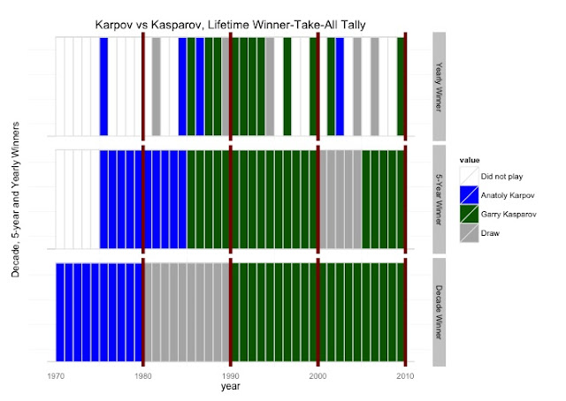
The idea behind this analysis is simple. If we take their lifetime games, plot the wins, what would it look like? We introduce one twist -- we'll be plotting the "winner-take-all" tallies, meaning that for every year, every five years, and every decade, we declare one person to be the 'winner'.
First, a note of caution: "Winner-take-all" type analyses lose a lot of information due to the roll-up. Whether a GM wins by 1 game, or a dozen games in a given year, he still gets only one "win".
At the outset, I must mention that this is NOT a chess exercise. I am ignoring the colors (whether each player had White or Black pieces) and even more egregious, I don't differentiate between standard and rapid games, or exhibition games. Time controls are ignored, as are openings.
This is a visualization exercise, and the idea is to see how it all looks when plotted.
I scraped the data from chessgames.com - where they have 201 games that the two have played. (I cleaned up the data and the csv file is available in github for anyone who wants to do their own analysis.) I use plyr to aggregate the data, and ggplot for the visualization. I wanted to try out this "pianogram" type visualization, where each plot looks like piano-keys.
Let's get the basics out of the way:
201 games - 138 draws, 37 wins for Kasparov, 26 for Karpov
Overall, Kasparov pretty much dominated Karpov. But how are these wins and losses spread across time? The two played for a little over 30 years.
The Winner-Take-All Method
In any given time period, say 1990, there can be 4 possible outcomes:
No games played, Equal number of wins, Karpov won, or Kasparov won. (If both players had the exact same number of wins in a given time period, we label that a Draw.)
Thanks to the 'plyr' package and ggplot, we can calculate the by-year, "5-year Winner" for each half-decade, and also the decade-wise winners by writing one function, and calling it with ddply.
So here's what the Yearly-Winner-Take-All looks like:
Let's plot the half-decade and decade plots. Again, note that only one GM is declared the winner for the entire decade, no matter what the difference in the scores are.
Now, we can put it all together, in one graph.
The complete R code to reproduce this analysis is available in this gist, along with the data-file in CSV file.


